# plot all solutions to compare them
plot(c(s, s1, s3, s3_bis, s4, s5, s6, s7, s8),
     main = c("basic problem", "add log linear targets",
              "add protected areas", "plan for future distributions" , "add locked-out constraints", "add gHM", "add NVDI",
              "binary decision", "change area budget to 10 percent strict PA expansion"),
     col = viridisLite::magma(n = 100, direction = -1),
axes = FALSE)7 Compare and analyse different solutions
The code here assumes that all the solutions in Chapter 6 have been succesfully run. What we will do here is to visually compare them among each other as well as by their performance (e.g. what they are able to achieve in terms of feature representation).
7.1 Compare spatial outputs
Let’s plot all the solutions from before to ompare them side-by-side.
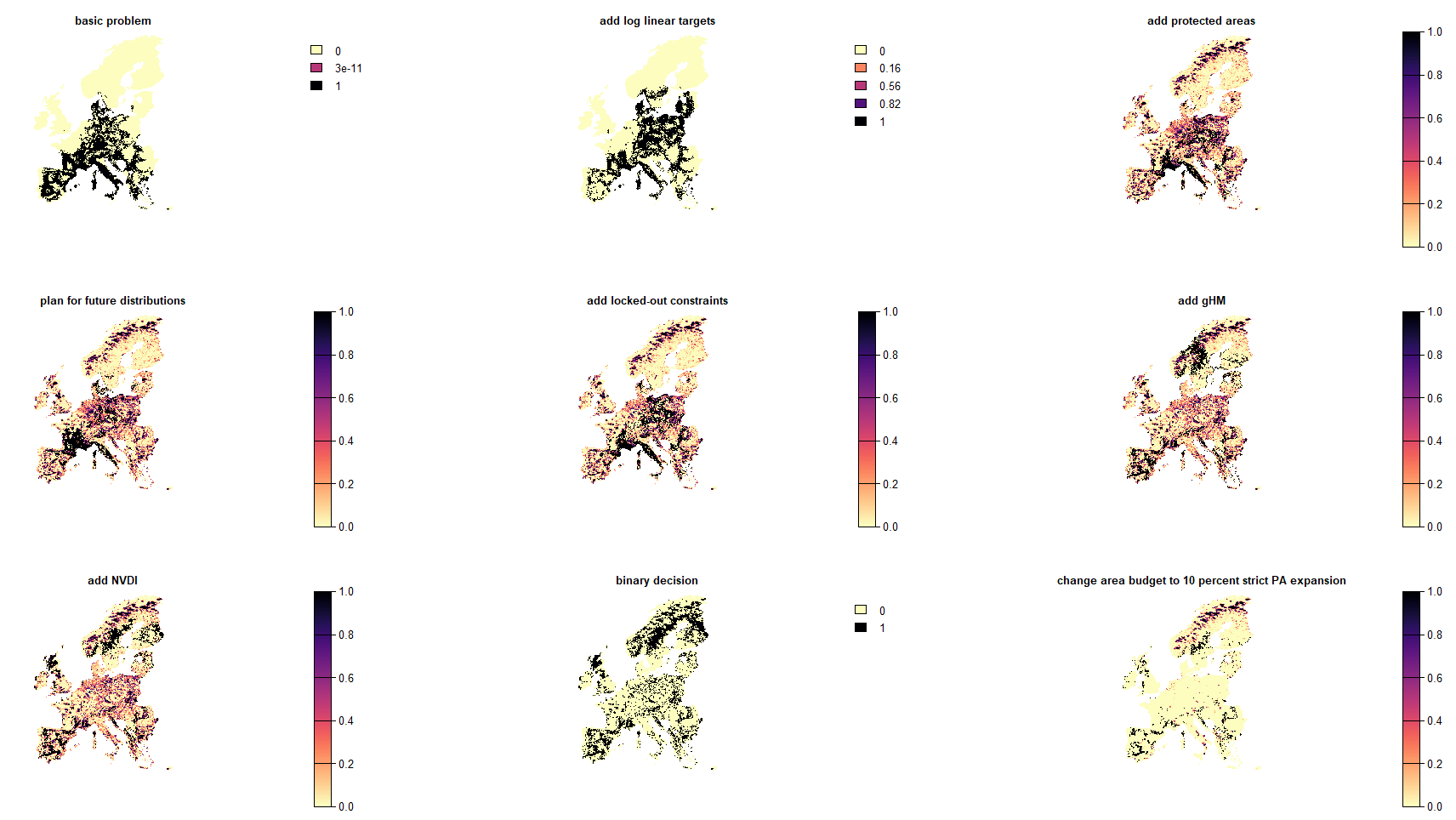
Obviously each problem formulation resulted in a slightly different outcome. There might be however different reasonings behind each of them. A simple idea could thus be to explore ‘safe bets’ for expansion priorities across all variations of the problems expanding on protected areas.
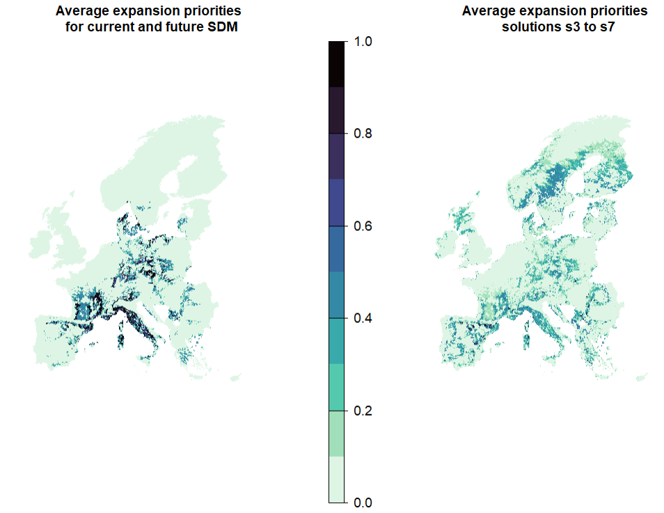
# Simply average all solutions. This works as those are shares
mean_s <- mean(s3, s3_bis, s4, s5, s6, s7)
exp <- mean_s - PA
exp[exp<0]<-0
# Compare this map with the one obtained without considering additions in solutions s4-s7 : how different are they?
plot(c(expansion_climate, exp), col = viridisLite::mako(n = 10, direction = -1), main = c("Average expansion priorities \n for current and future SDM", "Average expansion priorities \n solutions s3 to s7"), axes = F)- 1
- Set negative values to zero (these correspond to planning units that were locked out by urban/forestry layer, but that are currently protected)
The influence of input data and methodological choices
Remember that the solutions are highly dependent on methodological choices, and specifically on the input data (features, costs), constraints, and the objective function used, as well as the software. Proper care should be taken with any features or constraints included since those can have large consequences on the outcomes. Thus 90% of a good planning is the use of adequate data for the problem at hand so as to obtain an ecologically robust solution.
For a review on the influence of different types of data and methodological choices in conservation prioritisation, see Kujala et al. (2018) .
7.2 Compare performance of solutions
So far we looked at the spatial patterns of the various solutions, but this obviously does not tell us much about how good the solution actually is. For this purpose an evaluation metrics, ideally one related to the outcome being optimized, should be considered. In this case we assess the performance of the solutions for the species through their representation in each solution as well as the target shortfall.
# Load the ggplot2 package for plotting
library(ggplot2)

# First we create rasterstack of solutions for which you want to compare performance
# here, we compare the solutions that optimize for current distributions within 30% budget area

solutions <- c(s, s1, s2, s3, s4, s5, s6, s7)
names(solutions) <- c("basic problem", "add log linear targets", "add weights",
                      "add protected areas",  "add locked-out constraints", "add gHM", "add NVDI",
                      "binary decision" )

## analyse representation gains in the different solutions with a given budget
## for individual species
scenarios_performance_species <- data.frame(solution = character(),
                              feature = character(),
                              class = character(),
                              order = character(),
                              relative_held = numeric(),  ## representation: percentage of distribution held in the solution
                              relative_shortfall = numeric()) ## shortfall to target: how far from the area target for each species

## loop across solutions to extract representations for species and target shortfall
for (i in 1:nlyr(solutions)){
  cat(paste0(i, " \n"))  # keep track
  rpz.s_i <- eval_target_coverage_summary(p1, solutions[[i]]) ## for each species. Note that here, we assess the target shortfall based on the targets defined in p1, i.e. log linear targets.
  rpz.s_i$order <- redlist.trees$order[match(rpz.s_i$feature, redlist.trees$spp_name)]
  rpz.s_i$class <- redlist.trees$class[match(rpz.s_i$feature, redlist.trees$spp_name)]
  rpz.s_i$solution <- names(solutions)[i]
  rpz_i <- as.data.frame(rpz.s_i)
  scenarios_performance_species <- rbind(scenarios_performance_species,
                           rpz_i[, c("solution", "feature",  "class","order", "relative_held", "relative_shortfall")]
                           )
}


scenarios_performance_species$solution <- factor(scenarios_performance_species$solution, levels = names(solutions)) ## to plot solutions in the right order.

## compare performance of different solutions in terms of representation
ggplot(scenarios_performance_species, aes(x = solution, y = relative_held)) +
  geom_boxplot()+
  theme_bw()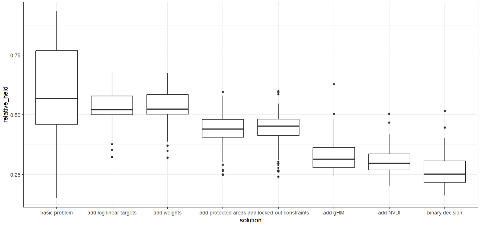
# subdivide per groups of species to be more ecologically informative
ggplot(scenarios_performance_species, aes(x = solution, y = relative_held)) +
  geom_boxplot(aes(fill = order), alpha = 0.2, outlier.size = 0)+
  theme_bw()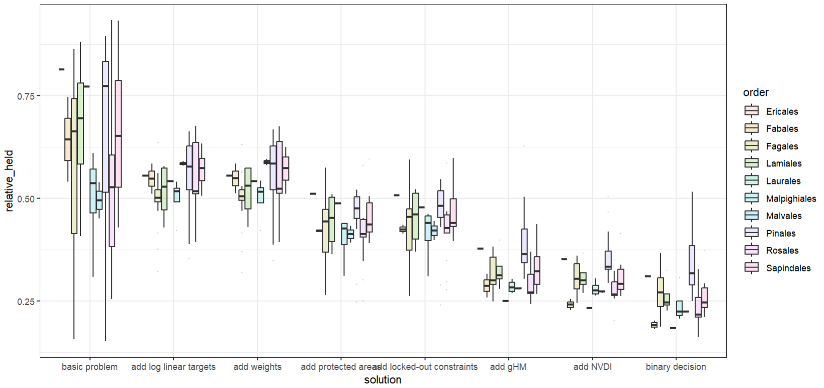
What can you interpret from this plot? It clearly seems as if there is a gradient from worst to best here, right? Remind yourself what is ‘better’ in this case!
We can also explore the outcomes grouped by class instead of family.
## add jitter points to see individual species representations
ggplot(scenarios_performance_species, aes(x = solution, y = relative_held)) +
  geom_boxplot(aes(fill = class), alpha = 0.2, outlier.size = 0)+
  geom_point(aes(x = solution, y = relative_held, colour = class), position = position_jitterdodge())+
  theme_bw()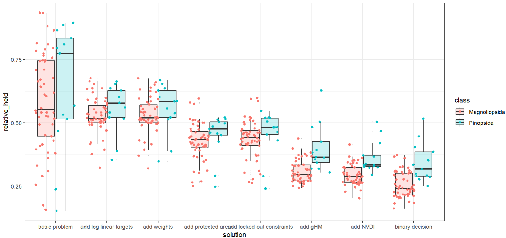
Lastly, we can also look at the shortfall and not at the representation (relative_held).
## compare performance of different solutions in terms of target shortfall
ggplot(scenarios_performance_species, aes(x = solution, y = relative_shortfall)) +
  geom_boxplot(aes(fill = class), alpha = 0.2, outlier.size = 0)+
  geom_point(aes(x = solution, y = relative_shortfall, colour = class), position = position_jitterdodge())+
  theme_bw()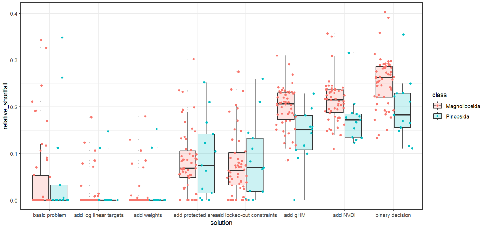
Tip
What do these two performance metrics tell us? Remember that we conducted a planning with different targets and altered them as such.
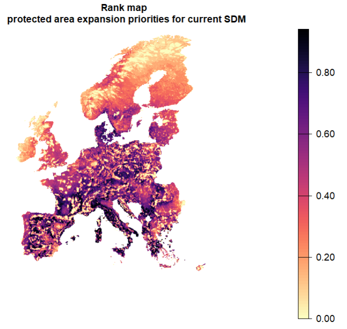
7.3 Create a spatial ranking of conservation importance
Sometimes one may be interested in the relative ranking in the conservation value of planning units without a fixed budget. but we can make one by solving iteratively while gradually increasing the area in the solution (i.e. the budget). The average of all solutions can give a ranking of the grid cells in the study area in terms of conservation importance.
Let’s produce a ranking map with increasing the budget. We will build on solution #3 that expands on protected areas for current distributions, but does not include other constraints. We will start with the existing protected area and incrementally add budget until the whole study area is reached. Then, we can average across all solutions to obtain the ranking. If the decision is a binary one, then a sum can also be used across solutions.
7.3.1 Incremential spatial ranking
Here we spatially rank a series of solutions with step-wise increasing budget.
# initialise a raster stack with existing PA to store solutions as budget area increases.
incremental.solutions <- PA
protected.land <- round(sum(PA[PA>0]))
total.land <- sum(PU[PU>0])
steps <- c(seq(from =protected.land, to = total.land, by = 5000 )[-1], total.land-1)
## skip the first as this is the initial PA layer + add the total land amount
## the argument "by" can be decreased for finer ranking.
## Note: this will take a while (1-2 minutes per run)
for (budget.area in steps){
p_i <- problem(PU, spp)%>%
add_min_shortfall_objective(budget = budget.area)%>%
add_relative_targets(1) %>%
add_feature_weights(redlist.trees$weight) %>%
add_manual_bounded_constraints(pa_constraints)%>%
add_cbc_solver()%>%
add_proportion_decisions()
s_i <- solve(p_i)
incremental.solutions <- c(incremental.solutions, s_i)
}
ranking.expansion.priorities <- mean(incremental.solutions) - PA
plot(ranking.expansion.priorities, col = viridisLite::magma(n = 100, direction =-1), axes = F, main = "Rank map \n protected area expansion priorities for current SDM")- 1
- Here we use relative targets of 1 that are equal for all species, such that each species should be fully represented across its entire distribution. This is because the solution only contains the area that is necessary to meet the targets. If all targets are met within an amount of area that is smaller than the budget specified, the budget is ignored.
- 2
- We subtract the currently protected area share here to specifically focus on expansion only.
7.3.2 Representation curves
The question is now, how does feature representation increase with added area? Let’s find out by plotting a performance curve, i.e. representation gains with increasing area, starting from the current representation within protected areas up to the total study area.
A rank map and associated performance curves are key outputs that Zonation provides automatically with each prioritisation. Prioritizr howeve does not automatically make these outputs as prioritizr most often enables to solve an optimisation problem under a fixed budget. But we can indirectly create these two useful outputs with prioritizr by iterating over increasing budget area.
# Data frame to contain the resulting curves
curves <- as.data.frame(matrix(ncol = 3, nrow = 0))

colnames(curves) <- c("area", "species", "relative_held")

incremental.solutions <- c(incremental.solutions, PU) ## add PU with all grid cells value = 1 for completeness

steps <- c(seq(from =protected.land, to = total.land, by = 5000 ), total.land) ## add current area protected as initial step, and total study area

for (n in 1:nlyr(incremental.solutions)){
  rpz_n <- eval_feature_representation_summary(p1, incremental.solutions[[n]])
  df_n <- data.frame(area = steps[n],
                     species = rpz_n$feature,
                     relative_held = rpz_n$relative_held)
  curves <- rbind(curves, df_n)
  }

## now plot the curves for each species + the mean
ggplot(data = curves, aes(x = area, y = relative_held, colour = species))+
  geom_line(alpha = 0.5) + ## one line per species
  stat_summary(fun.y=mean, colour="black", lwd = 0.9, geom="line") + ## plot mean on top in black
  scale_colour_discrete(guide = "none")+ ## hide the legend
  ylab("proportion distribution held") +
  theme_bw()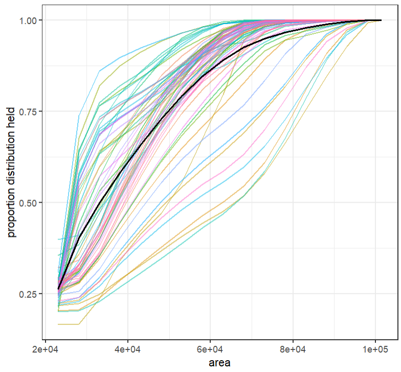
7.3.3 Still time and interested in more?
Try to make the graph above however with the number of features that have their targets reached at each step. While intuitive in terms of interpretation, can you guess why the number of targets reached is not a good idea for this particular problem (Hint: also in Chapter 5 ).